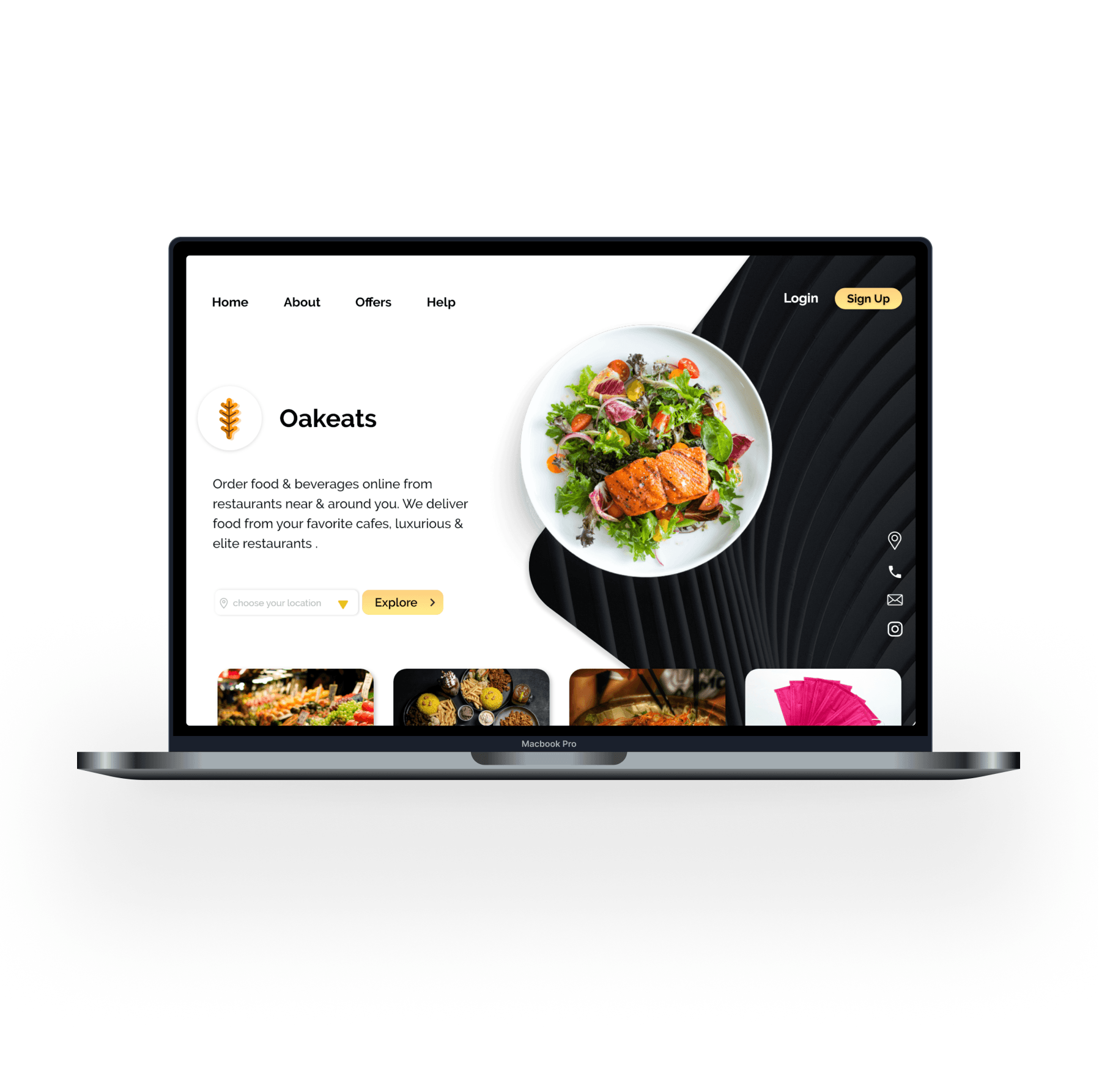
Oakeats
HCI Coursework Project: A Food Delivery Platform
Aug ‘20 - Dec’20 ( 16-18 weeks )
- User Research
- Design Prototyping
- Usability Testing
Overview
Oakeats is a concept project developed for my Human-Computer Interaction (HCI) coursework during my sophomore year at Vellore Institute of Technology. This was an impromptu concept created in response to the early challenges of the Covid-19 pandemic.
This project was a collaborative effort with a team of five university students. I led the design of our web application and also served as the team’s project manager
The Challenge
During the early stages of the Covid-19 pandemic, risks of eating out and ordering food online became increasingly evident, due to concerns over the potential transmission of the virus through food and packaging.
Based on these preliminary observations, we identified a potential gap in the market for a platform that could assure users of safe access to food and essentials (e.g. medicine).
The Objective
Our goal was to create a single platform for food delivery and essential items that prioritized safety, hygiene, and convenience, without having the need to juggle multiple apps.
Project Milestones
- User research and requirement analysis:
- Conduct user research to understand needs and preferences.
- Analyze data to identify patterns, pain points, and opportunities.
- Design conceptualization:
- Choose a technique to visualize the data flow or structure of the system.
- Create wireframes/low/mid-fi prototypes based on findings.
- Design hi-fi prototypes using insights from research and data flow methods.
- Validate alignment with Shneiderman’s Eight Golden Rules of Interface Design and Nielsen’s 10 Usability Heuristics
- User testing:
- Perform user testing to validate the usability and effectiveness of the design and solution.
Work Timeline

Tools
 Adobe XD
 Adobe Illustrator
 Miro
Miro UsabilityHub (now Lyssna)
 MS Office
User Research
To learn about our audience, we employed a combination of surveys, card sorting, and user interviews to gain insights into their preferences, behaviors, and needs
User surveys
For conducting surveys, we crafted a diverse set of questions and circulated among students, professors, parents, and friends, obtaining over 100 responses, with the majority aged 20-25.
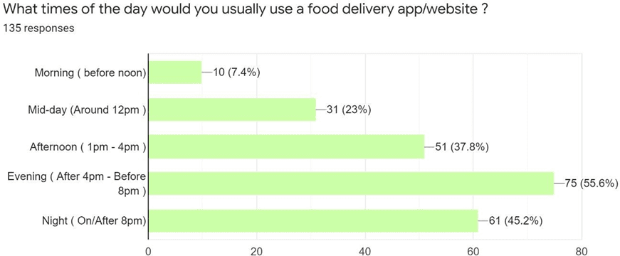
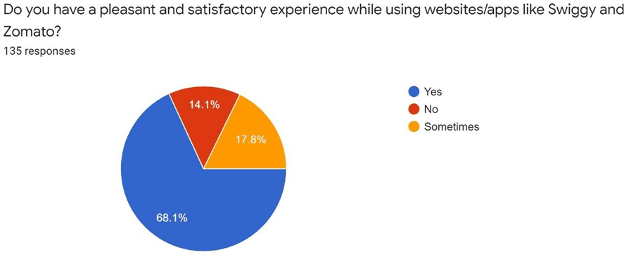
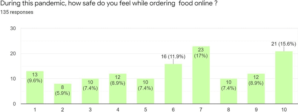
User segmentation and persona building
By analyzing the data collected from our surveys, we grouped users with similar characteristics and requirements.
From this grouping, we created personas representing different segments of our target audience. This step helped us visualize what potential user profiles might look like and additionally served as a shared reference when we had discussions and brainstorming sessions.
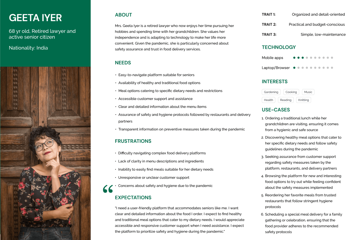

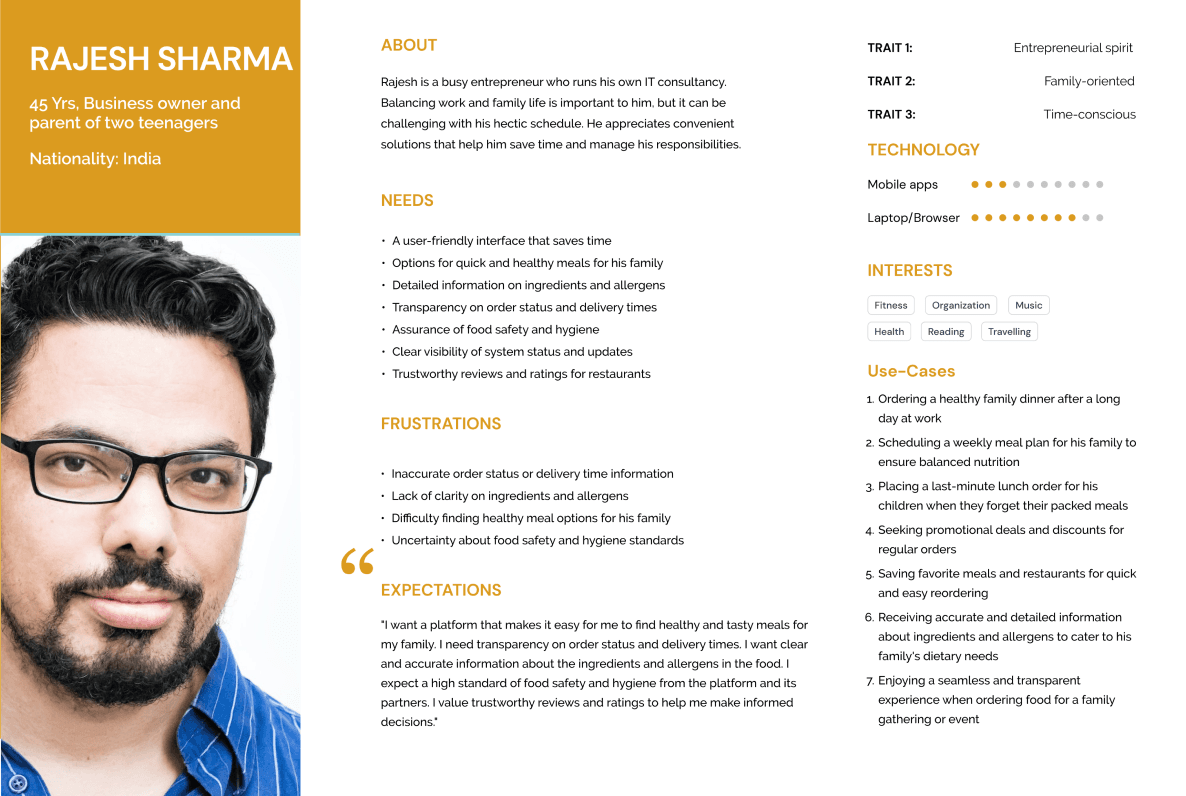
Sample user personas
User Interviews
After understanding our target audience through surveys and persona building, we delved deeper by conducting user interviews to:
- Enhance user’s sense of safety and assurance, particularly during the Covid-19 period.
- Determine initial expectations from an online food delivery application.
- Identify shortcomings of current food delivery platforms and explore improvement areas.
Top Themes and Insights Identified
- False Information: Mismatches between pictures or ingredients listed and the delivered food often lead to user dissatisfaction and mistrust towards the platform.
- Safety Concerns: Users are keen on knowing the safety measures (e.g. contactless delivery)
- Live Order Tracking: Inaccurate delivery times or navigation issues can cause frustration, with users valuing real-time updates and clear directions.
- Navigation Flexibility and Easy Access: Users appreciate easy navigation to recent orders, saving items for later, and making on-the-go modifications for a convenient experience.
Design Process
Card Sorting
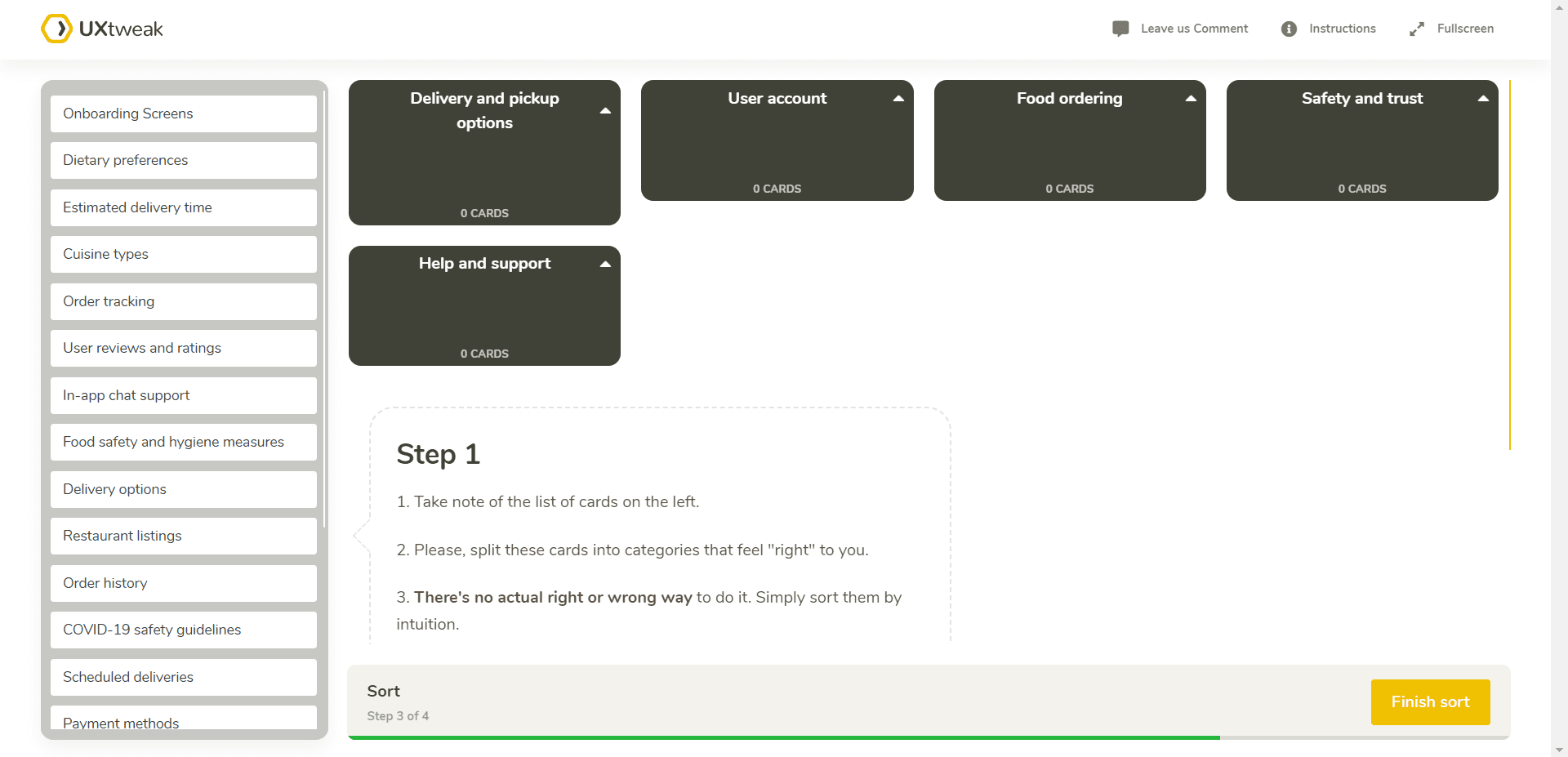
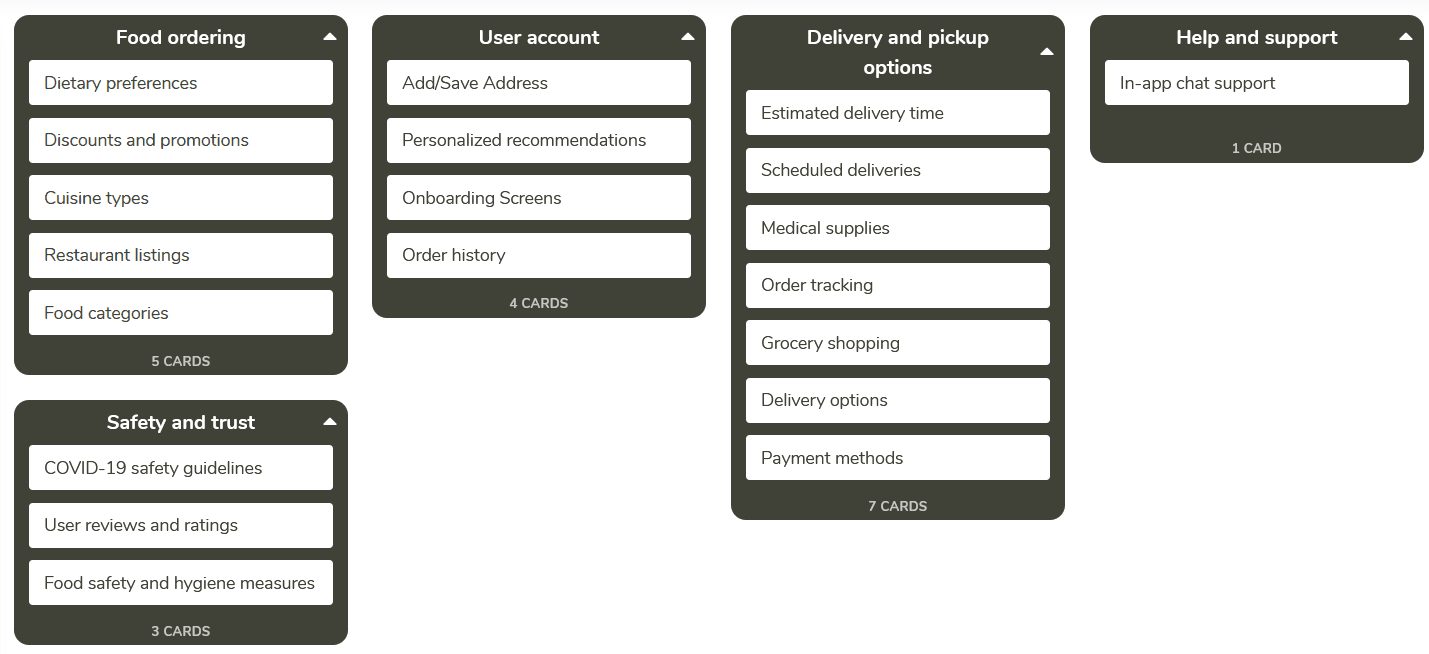
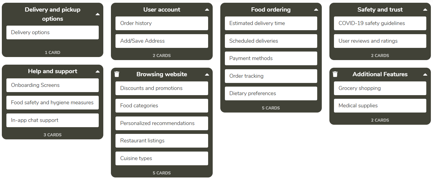
To ensure we build a relevant and effective solution, we chose to conduct remote card sorting sessions to see how potential users group information and what terms make sense to them.
Sitemap
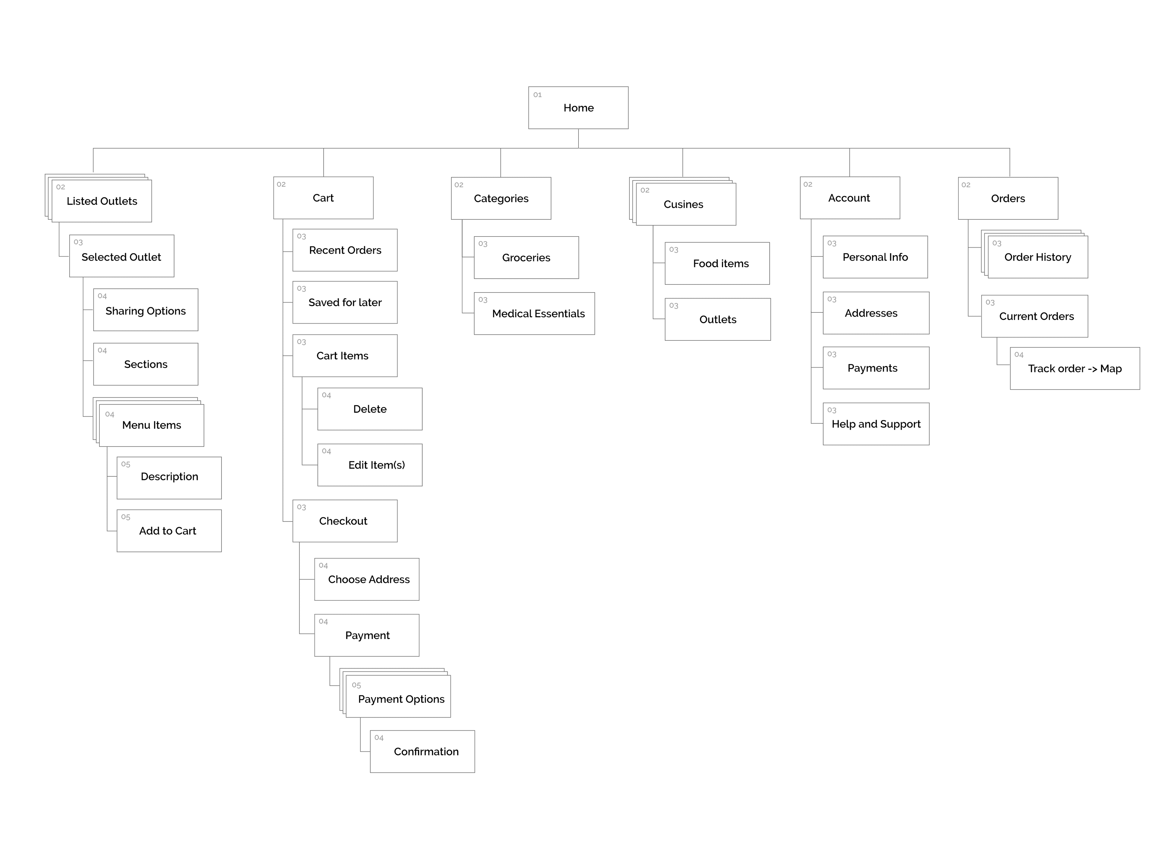
After gathering insights from our card sorting, we created a site map to visualize our web application’s architecture. This laid a clear foundation for designing a platform aligned with our user’s expectations and usage patterns.
Wireframes
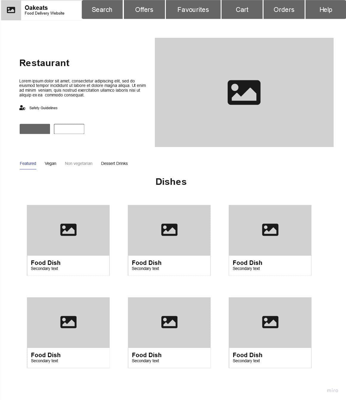
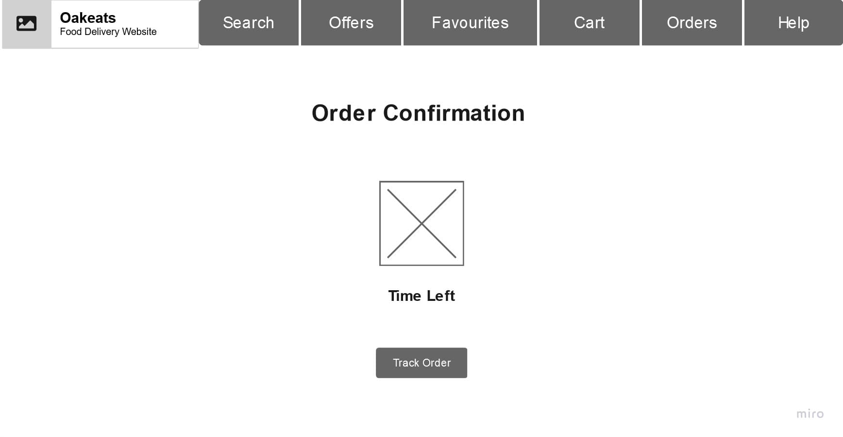
Next, we began developing the initial concepts for Oakeats by creating wireframes. We broke down our product concept into various modules we aimed to address.
The modules included:
- Sign-in and Onboarding
- Home Page
- Restaurant Pages
- Cart and Checkout
- Order Confirmation and Tracking
Sign-in & Onboarding
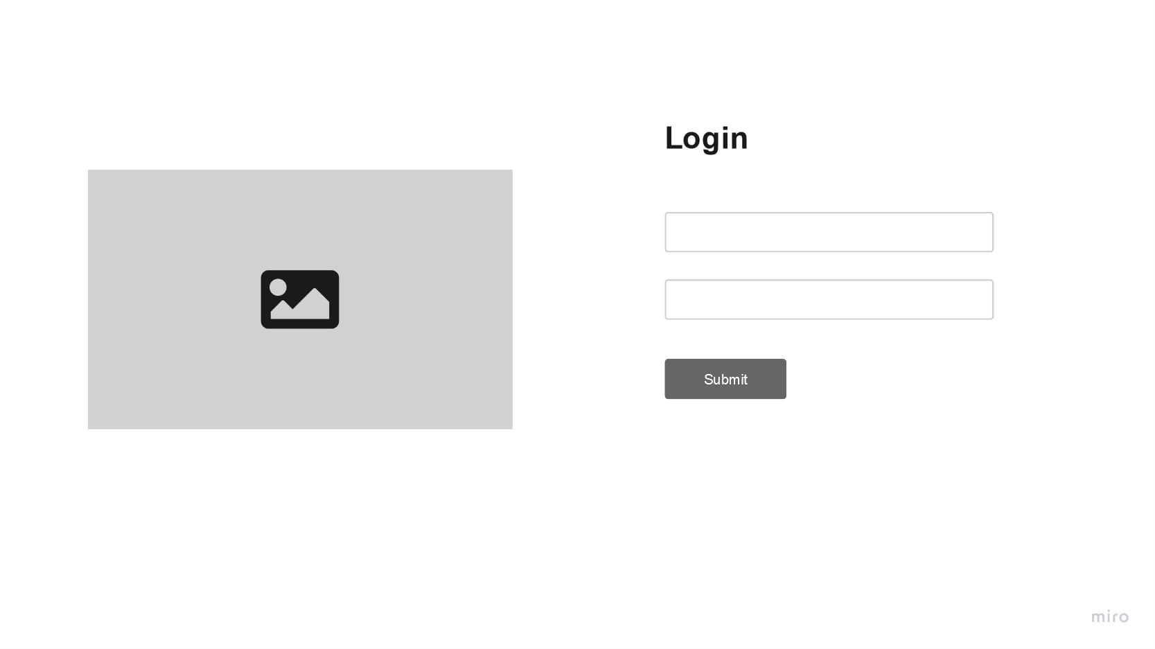
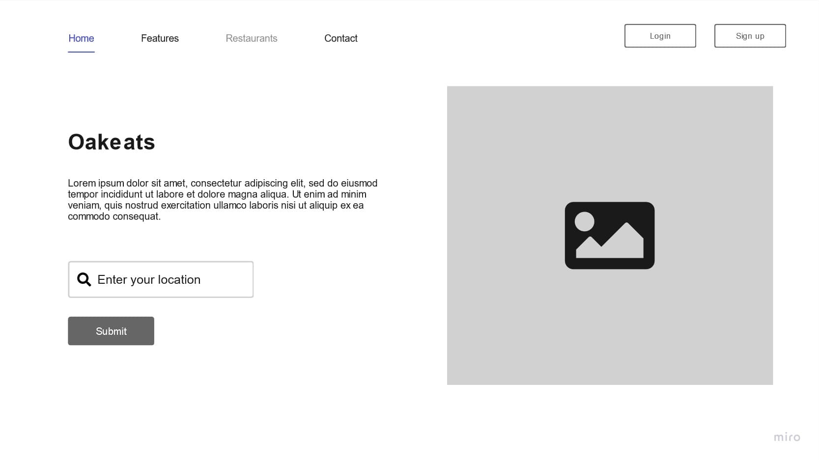
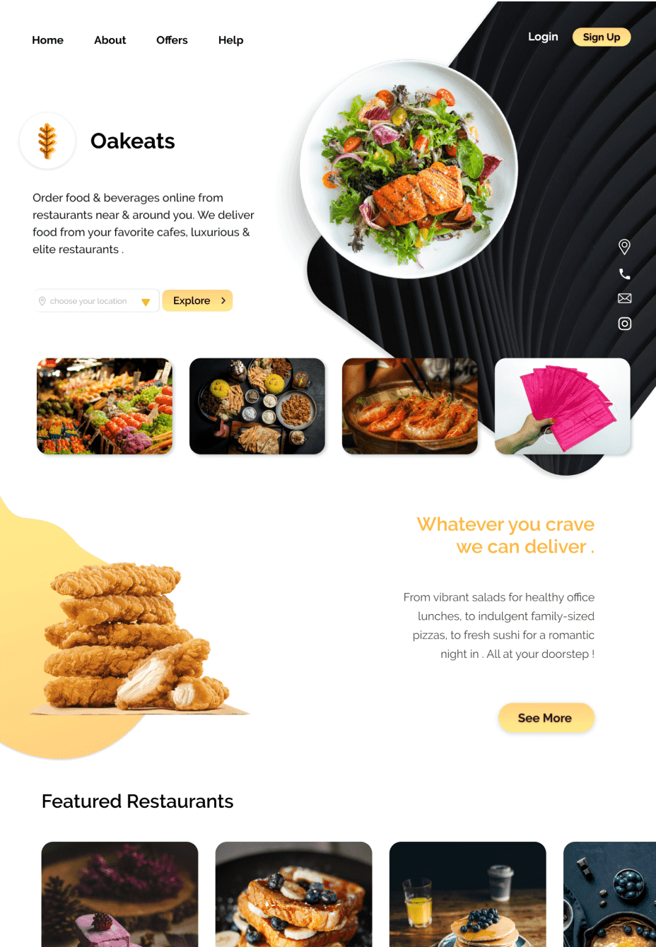
Designed authentication pages for login and sign-up. Users can choose to browse without an account on the landing page. Upon loading, users are prompted to input their location for a personalized experience.

Home Page
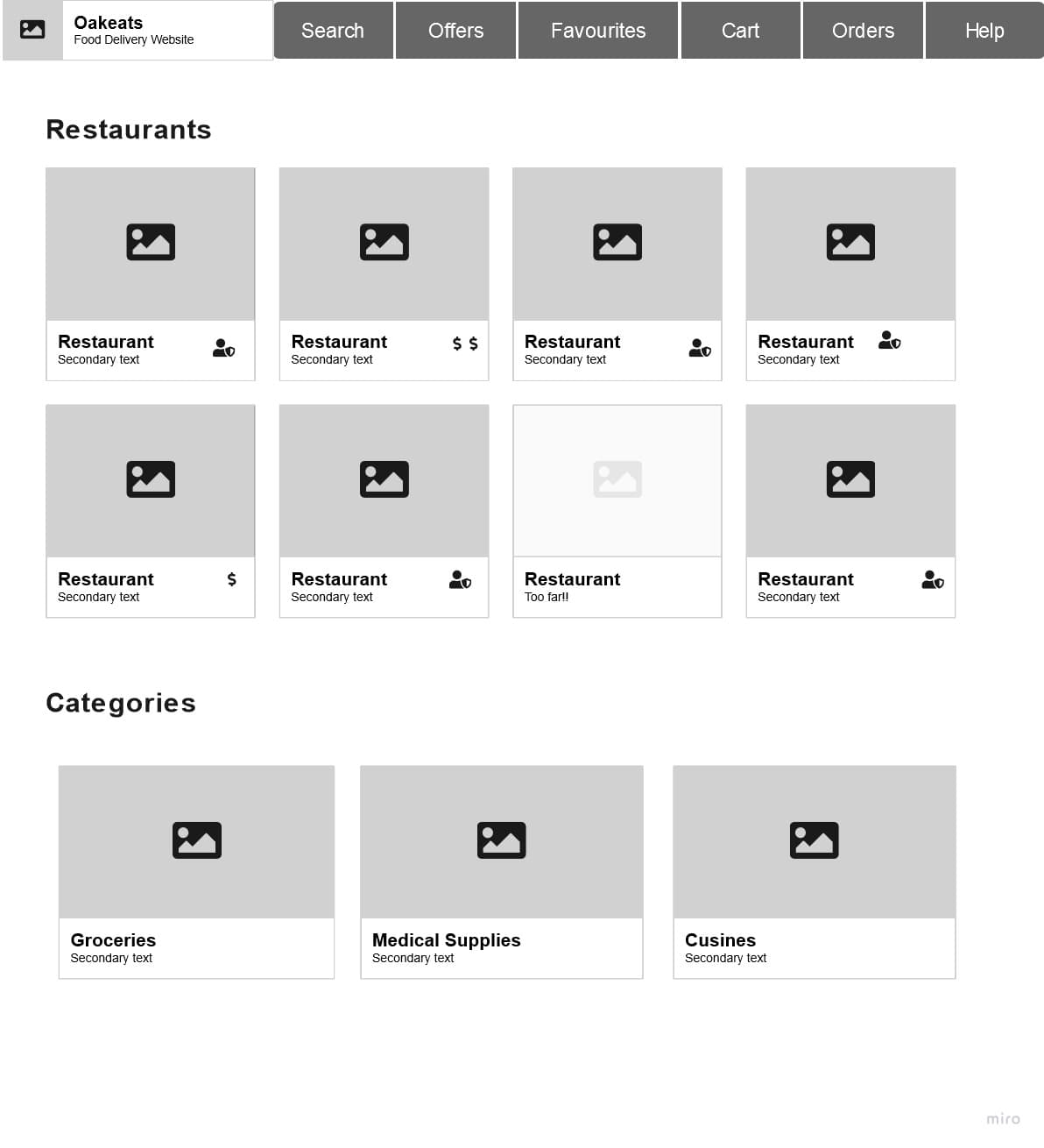
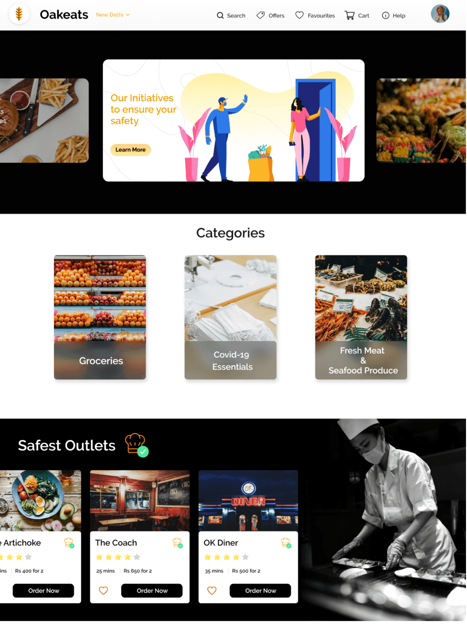
Based on our research, we decided to incorporate the home page with features such as search, order history, and offers. Added badges to restaurant cards for price range, safety, and availability. Included categories for groceries, medical supplies, and various cuisines.
Restaurants
Each restaurant page displays important information like safety guidelines and food categories for improved transparency. Details on each card are intended to guide users to make informed decisions.
Cart & Checkout
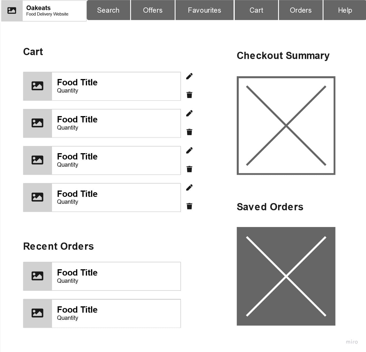
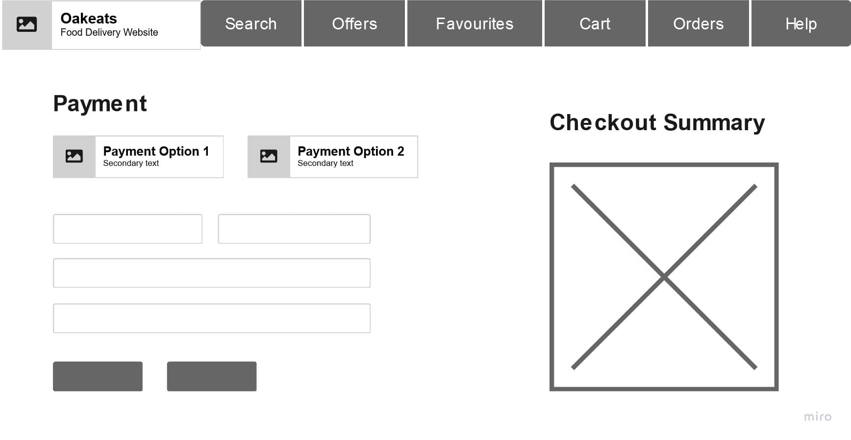
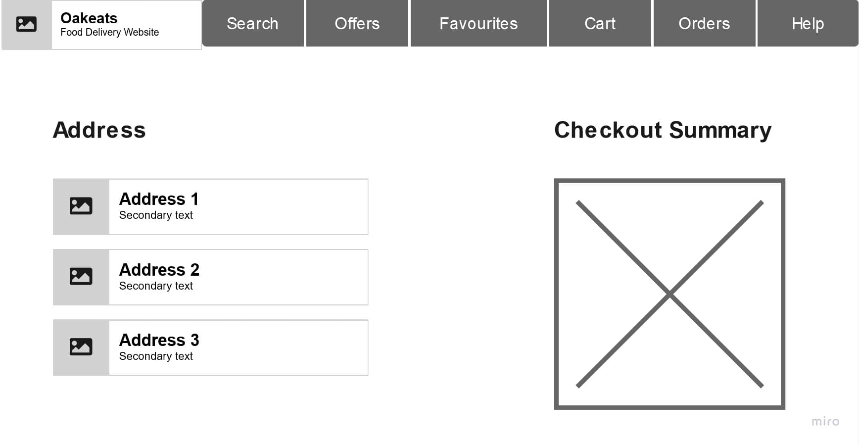
Designed a cart and checkout process with clear edit/delete options for cart items, sections for recent orders and saved-for-later items. Added options for easy address and payment method selection, and order modification or cancellation.
Order Confirmation & Tracking
Designed an order acknowledgment page with estimated delivery time and live tracking features. Users can track orders in real time and make changes within a specified time frame.
Theme and Typography
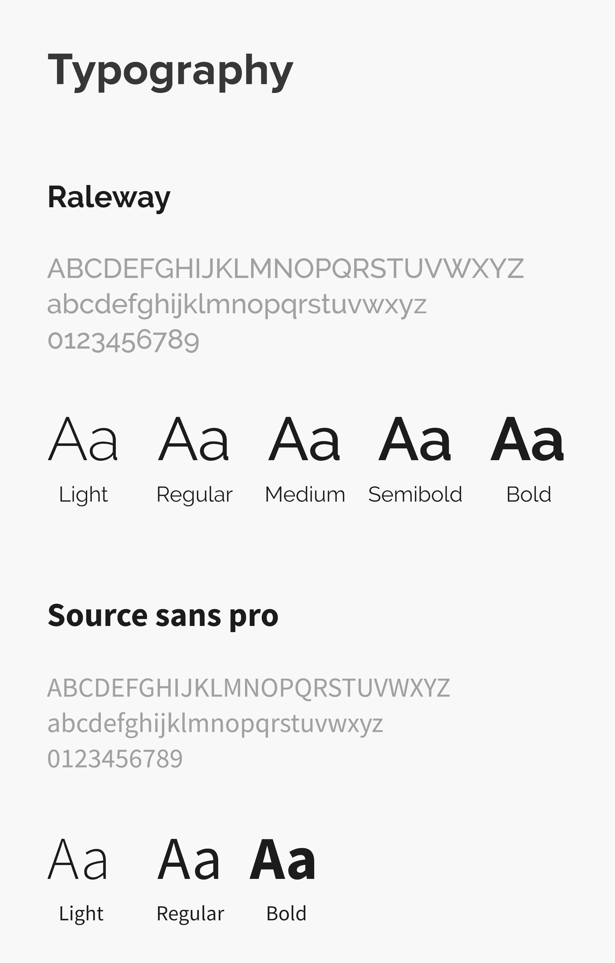
Next, we narrowed down to a color palette aimed at maintaining visual appeal while also establishing a clear hierarchy within our application. For typography, we selected typefaces with the intention of improving readability.

Design Prototypes
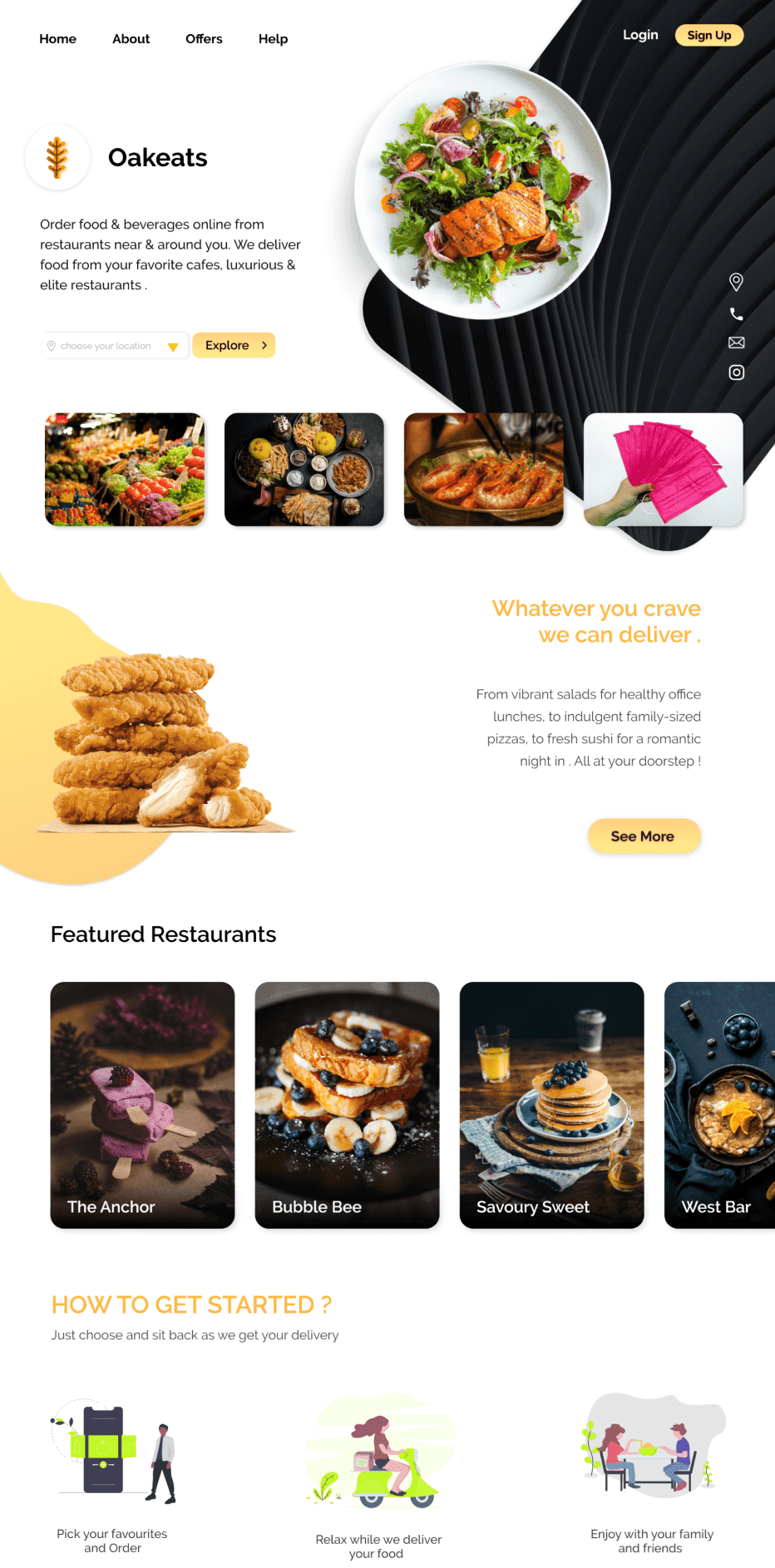
For unauthenticated users, the landing page offers location-based browsing and a streamlined onboarding guide.
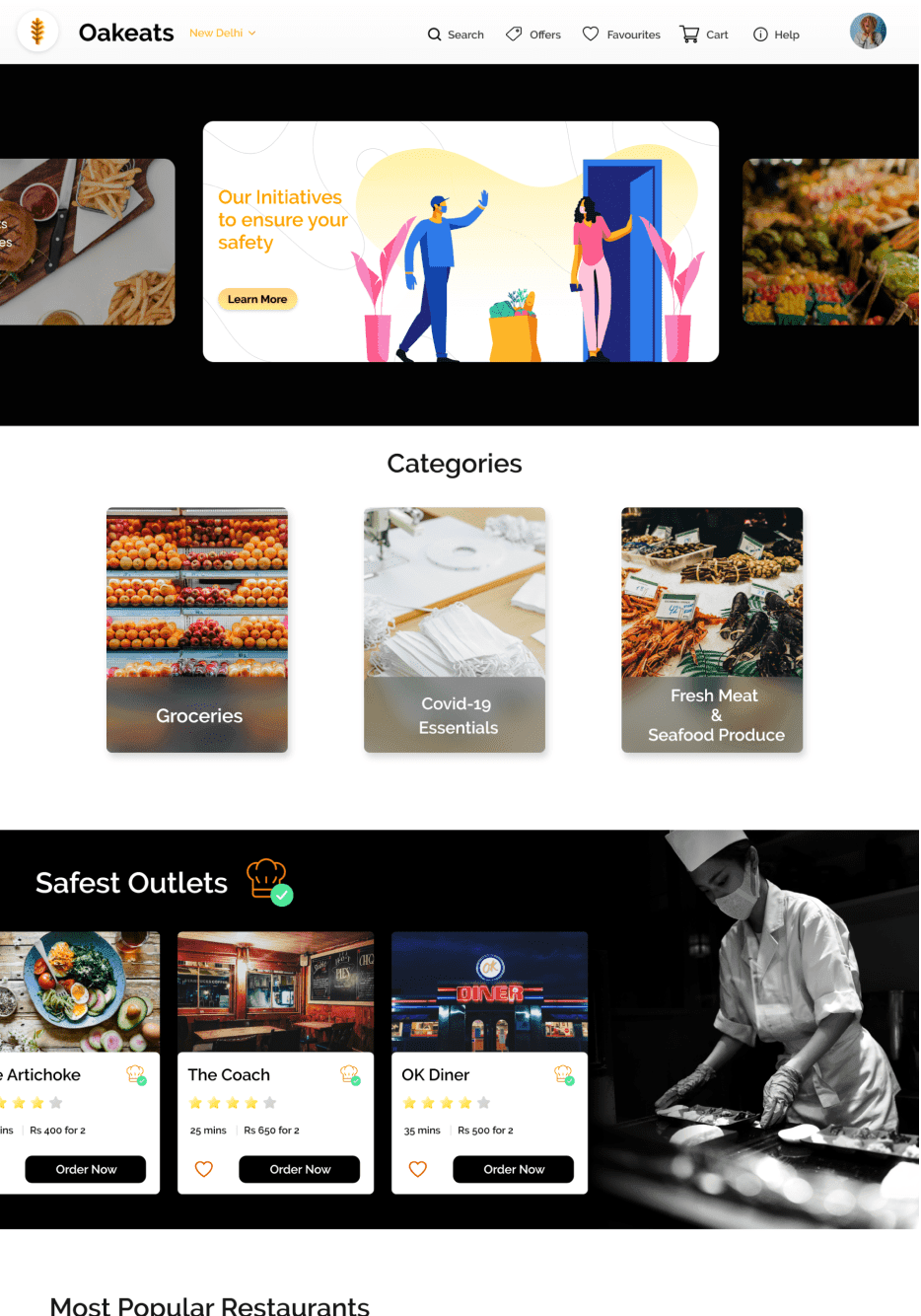
Once logged in, users are greeted with an overview of various service categories, as well as highlighted restaurants that uphold verified safety measures.
The header of the restaurant page displays key details like closing hours, delivery estimates, and the safety practices they follow. This covers measures taken in the kitchen, during packaging, and by the staff.
 Restaurant details
 Safety measures followed by the restaurant
During checkout, users can select from saved addresses and pick their preferred delivery method. They can also easily navigate through any stage of the checkout process and make changes to their order as needed. Once the order is placed, users have the option to make edits up until a set time and can track their order in real-time based on their location
 Address and delivery mode at checkout
 Live tracking
Testing
During the early stages of our prototype design, we chose to opt for guerrilla testing as our initial approach to collecting user feedback. This enabled us to make informed decisions and prioritize key improvements before diving further into design.
 Guerrilla Usability Testing Results
5-Second Usability Testing
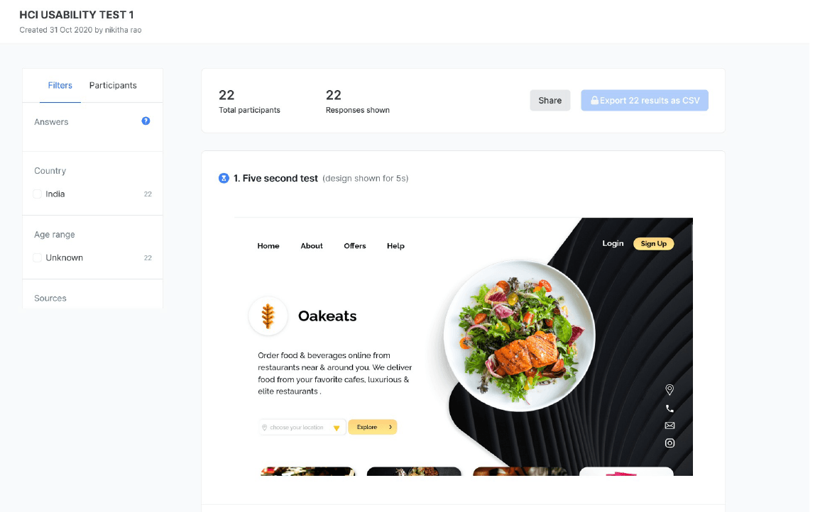
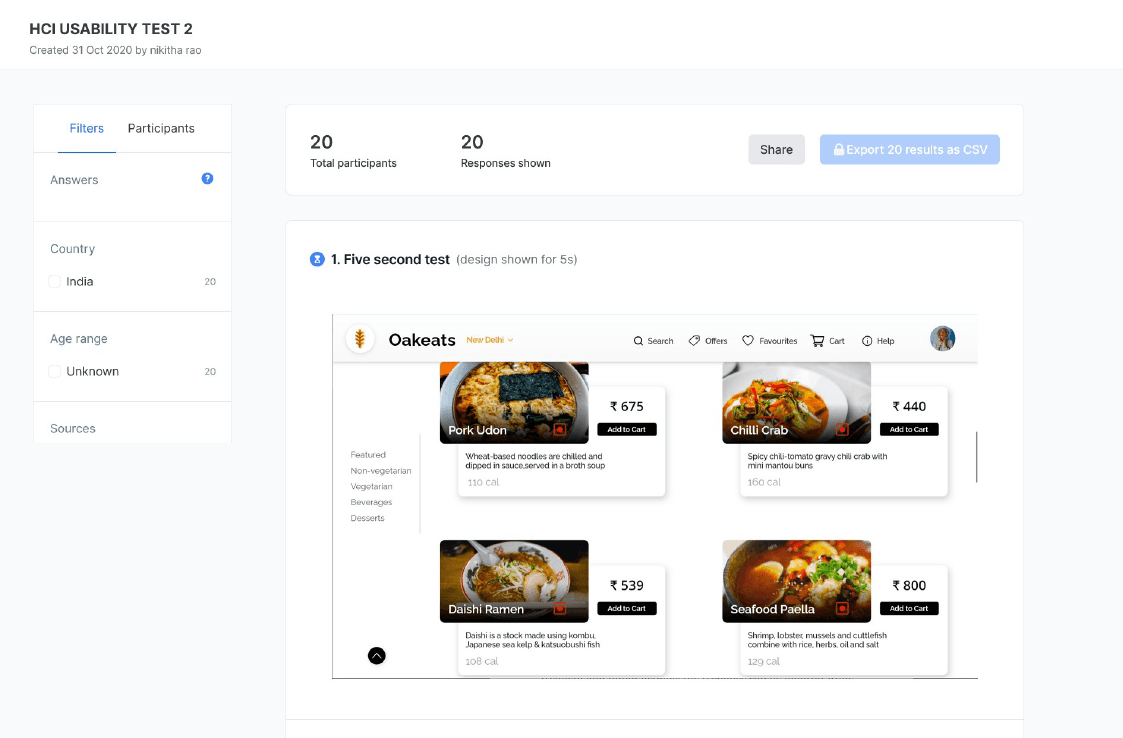
We then conducted 5-second usability tests with our updated prototypes to quickly assess if users could grasp the core functions and purpose of our platform.
We set up three sets of tests on UsabilityHub, each targeting a different section and a flow of the website, and invited a group of over 40 participants to partake.
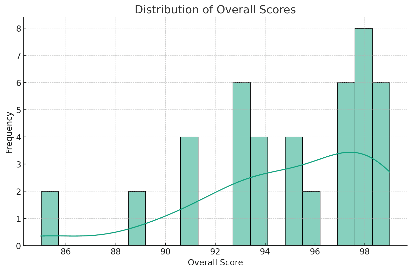
Results

Key Insights
On evaluating our results, we were able to derive the following insights from our testing phase:
- On average, participants engaged with both flows for about 56 seconds.
- The platform was accessed across a diverse range of devices, including both desktop and mobile
- User satisfaction was notably high, with the majority of scores close to 95 out of 100.
- The color scheme and design elements received overwhelmingly positive feedback.
- Most participants reported that they easily found all the information they needed on the platform.
Throughout the design process, we made sure to take into account all the feedback and insights we received from our research and testing. This allowed us to make informed decisions and create a platform that met the needs of our users.

