Exocure
A medical mobile app to facilitate foot monitoring for diabetic patients
- Product Research
- Information Architecture
- Design Prototyping
- App Development
Project
Summary
Exocure is a medical application designed to enhance the feasibility of monitoring diabetic foot conditions from the comfort of home.
I worked in a student group of 3 under the guidance of a project mentor and 2 medical specialists. This project was part of my final year capstone project while I was an engineering student at VIT, Vellore.
Timeline
Jan → Apr ‘22 (4 Months )
Role
Product Designer & Developer
Team
ML Developer
Hardware Engineer
Tools & Tech
Adobe XD
React Native
Expo
Challenge
Diabetic foot problems often go unnoticed until progressed to more advanced stages.
(e.g. wound imaging systems and off-loading devices) that could help detect early signs of foot problems in patients.
Outcome
We built a to enable quick, easy diagnoses at home and serves as a medium to support early conversations between patients and healthcare professionals.
 Run quick diagnosis
 On-device reports and feedback
 Find nearby support
Project Deliverables & Milestones
- to understand the problem and review current solutions
- Create a hardware device that can interact with patients to detect early symptoms
- to facilitate patient interaction and diagnosis
- Develop a deep learning technique to
- Review and on final designs and prototype
 Project Timeline Chart
Gathering insights from research and specialized medical consultation
Most scanning applications are intended for use under medical supervision, often lacking patient-focused accessibility and interpretation
Exploring opportunities
Provide clear, understandable information and instructions, designed for non-expert users
Facilitate navigation and interpretation of results, with options to share results with healthcare professionals for further consultation when necessary
 Viewing scanned foot data on ‘PodiaTech’ mobile app
 Measuring foot for diagnosis on ‘VoxelScan’ mobile app
 Diagnosis results display in ‘Pocket PEDIS Score’ mobile app
 Home screen interface of ‘MyFootCare’ mobile app
Most foot diagnosis apps don’t provide pathways for patients to seek appropriate medical assistance based on their diagnoses
Exploring opportunities
Listing out specialized recommendations based on individual demographics and diagnosis results
Options for users to connect with healthcare specialist on-device
Defining product goals: Establishing a clear direction for design and development
Based on my research insights, I began to prioritize actionable goals for the MVP based on both technical and design effort
 Finalized product goals for design and development
Planning on app structure: Handling navigation and core features
 Structure of ‘Sense’ tab
I included necessary prerequisites such as device pairing and instructional guidance within respective tabs to avoid any complex navigations, and facilitate quicker flows
 Navigation tabs on the app
 Adopting a breadth-first approach provides patients with an immediate, high-level view of the app, allowing instant access to core functionalities like diagnosis, reports, healthcare support, and personal information, without navigating deep into the app
Strategizing interaction design: User flows and engineering considerations
How does a new user quickly onboard and perform diagnosis?
 Diagnosis flow for new users
What does this flow look like for returning users?
Can it be made quicker?
 Diagnosis flow and logic for returning users
 I incorporated conditionals within the flow, to reduce repetitive or unnecessary steps and shorten the overall process for returning users
This helped in making early considerations, such as how often to update user information or strategies for managing the app’s state during scenarios like pre-existing device pairings or connectivity disruptions during diagnosis
Translating solutions into high-fidelity designs & building a coded app prototype
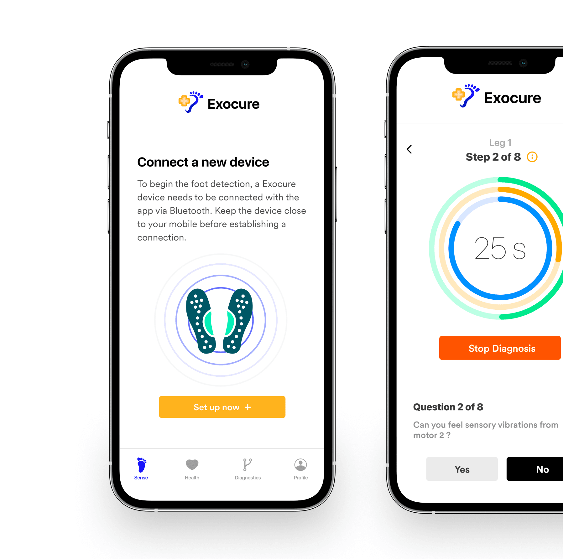
Conduct diagnoses and navigate the application through a structured process with guiding information for non-expert users
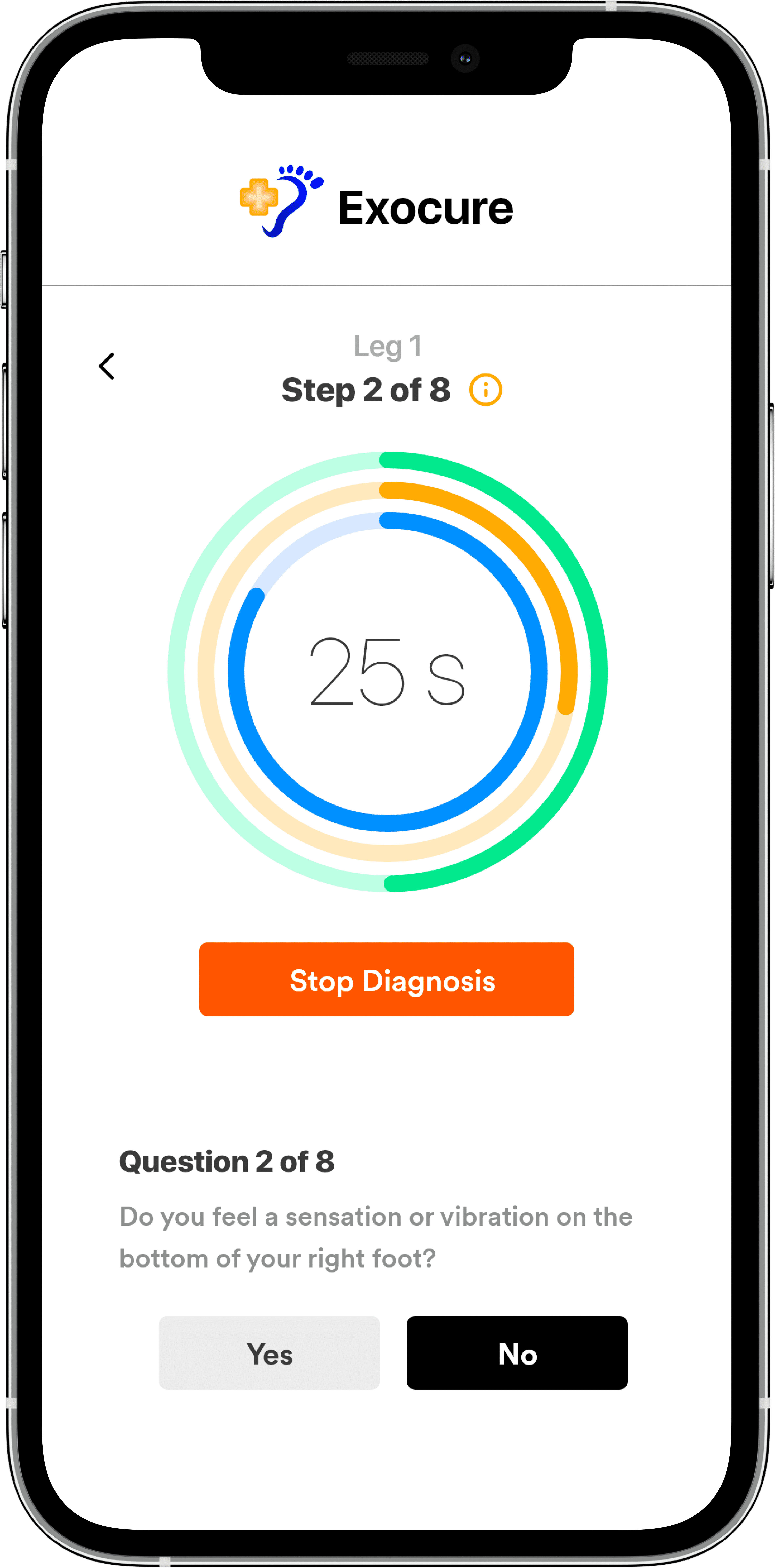
Before each diagnosis, users are given clear instructions for navigating the process and operating the Exocure device. During the procedure, straightforward yes/no prompts are presented to assist in conducting diagnosis.
 Access to core features through navigation tabs

Diagnosis questionnaire and confirmation message
 Onboarding instructions to conduct diagnosis
 Visual representation of diagnosis results

Diagnosis results overview and preliminary recommendations
Receive feedback and healthcare recommendations based on diagnosis results
In the ‘Diagnostics’ tab, users can find their diagnosis results. This includes visual representations and analysis of parameters such as ulcer risk and affected areas. Preliminary recommendations are offered in the ‘Health’ tab.
Reach out to relevant healthcare services nearby. Share diagnostic reports and results with healthcare providers
Based on the diagnosis, users get recommendations for relevant healthcare services available nearby, along with contact info and an option to share their diagnosis results for further evaluation.
 Relevant healthcare services nearby, with contact info
 Diagnosis reports with share option
I developed the app prototype using React Native and Expo. Try it out!
You’ll need the Expo Go app on your mobile to scan the QR code & use the app. Download it for free from the Google or iOS app store. This is a prototype for demonstration; typically, an Exocure device is required for diagnosis.
The following libraries and technologies were used for the final implementation:
- Authentication and Database → Firebase
- ML Implementation and integration → TensorflowJS
- Bluetooth Integration → React Native Bluetooth Serial
- Splash screen, App Icon/Branding → Adobe XD, Illustrator

QR Code to access the app on Expo Go
Reflecting on the outcomes of this project: What did I learn?
This project was both unique and challenging. We aligned with industry professionals and collaborated across multiple disciplines. Despite facing quite a few setbacks along the way, we managed to achieve most of our initial product goals.
Early MVP focus streamlines scalability and adaptability
Facilitating discussion and alignment on MVP must-haves vs. nice-to-haves, was pivotal in setting our project’s direction. This , ensuring we focused on what needed to get built first and what could be added on later.
Understanding industry-specific regulations before diving into product development
Being informed about the background, local regulations, protocols, and trends is essential for products in regulated sectors.
In our project, a and likely led to more strategic decision-making.

