Ayuda
Pro bono website re-design project built on React and Gatsby
Feb ‘21 - May’21 ( 12-16 weeks )
- Redesign Project
- Web Development
- Visual Design
- Responsive Design
Overview
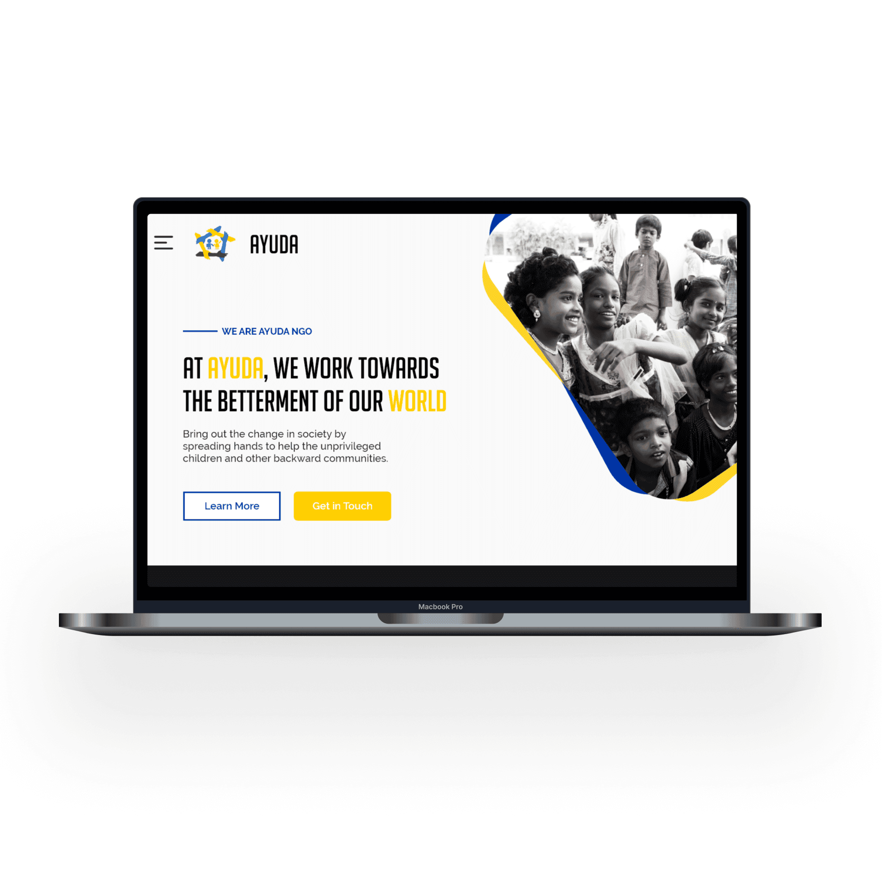
During my time as an undergrad student at Vellore Institute of Technology (VIT), I took on a side project to redesign the website for Ayuda VIT. Ayuda is a student-led, non-profit organization is dedicated to conducting social activities on campus and the greater community. The existing website was outdated and required a modern redesign to better highlight their work and extend their reach online.
In this pro bono project for Ayuda, I served as the sole contributor, working closely with key stakeholders such as the NGO’s president, board members, faculty coordinator, and alumni members.
About Ayuda NGO
Ayuda NGO is a student-led organization at VIT dedicated to raising awareness about various social issues. Founded by a small group of students, the organization aims to create a positive impact in the local community and beyond. Some of Ayuda NGO’s initiatives include organizing blood donation camps, food drives, and fundraisers for charitable causes.
Deliverables and Milestones
- Understanding the audience and identifying improvements
- Website redesign
- Website development and deployment
Research
Understanding Requirements & Target Audience
To start, I met with the Ayuda NGO team to understand their expectations and requirements for the new website. During this initial meeting, we discussed project goals, their mission, and the target audience for the website. The team identified three primary user groups: students, university faculty and staff, and the general public.
- Students – both internal and external university students
- University faculty and staff – potential supervisors and supporters of the club’s activities
- General public – people who may be interested in learning about Ayuda NGO, providing sponsorship, or potential collaborators
Observational User Research
After my initial discussion with the Ayuda team, I wanted to validate their assumptions and uncover additional gaps by conducting user research with potential users.
I recruited five participants and prompted them to navigate through the website casually. While they were interacting with the website, participants were instructed to think aloud to provide feedback based on their experience in real-time. Some of the key takeaways from this exercise were:
- User engagement and content interest– None of the participants seemed particularly interested in the content. Participants either scrolled through quickly without reading or skipped sections entirely.
- Navigation and layout issues, especially on mobile– Multiple participants complained about the confusing layout and unclear navigation, particularly on mobile devices.
Identifying pain points
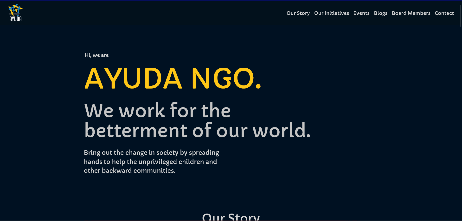
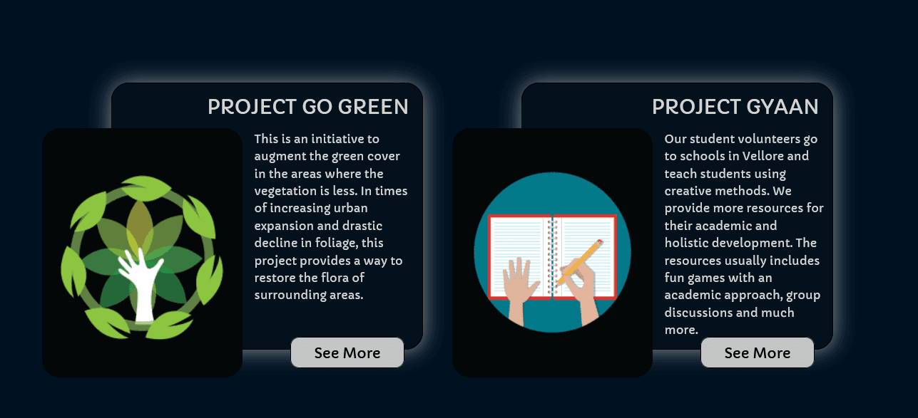
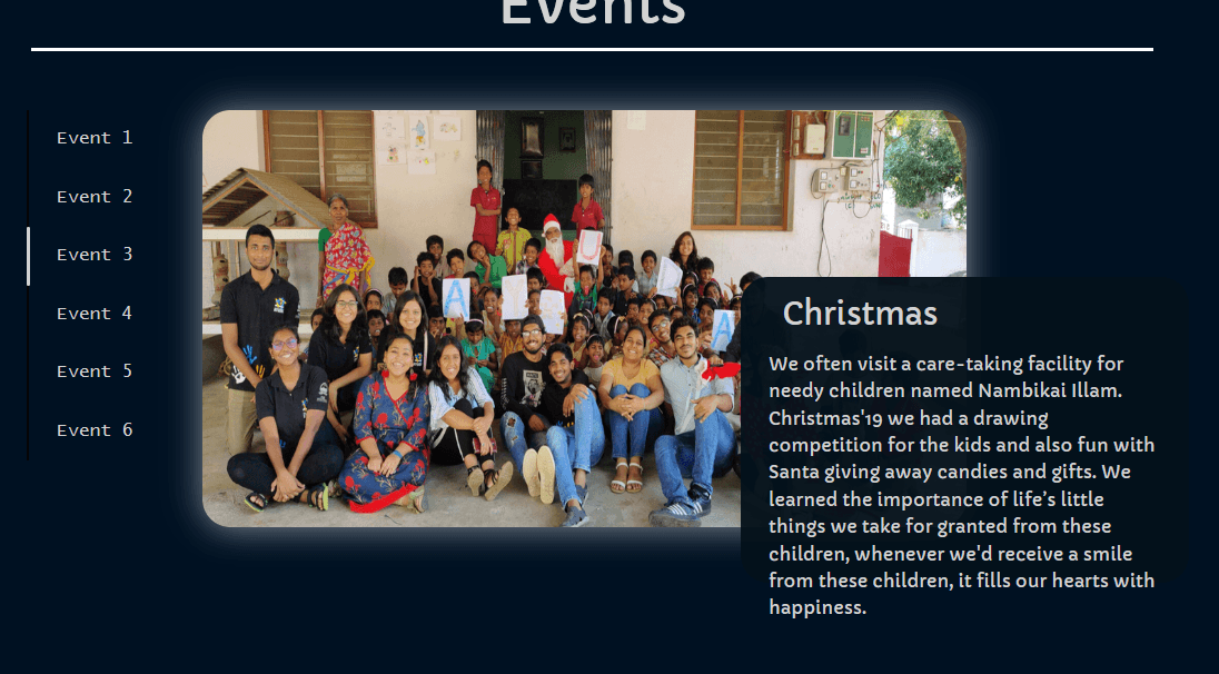
The major pain points I was able to identify from conducting research and analyzing the previous website were:
1. Dull and poor visual design
- The color palette here creates a somber tone which might not be appropriate for an organization that aims to bring positivity and energy to society.
- This might also make the website appear dark and uninviting — potentially discouraging users from engaging with the organization. The brand and tone of the organization was not fully been taken into account here..
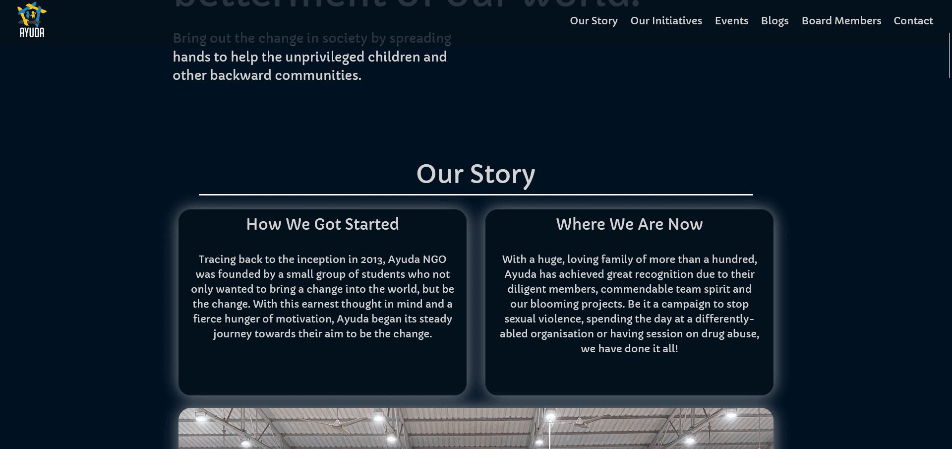
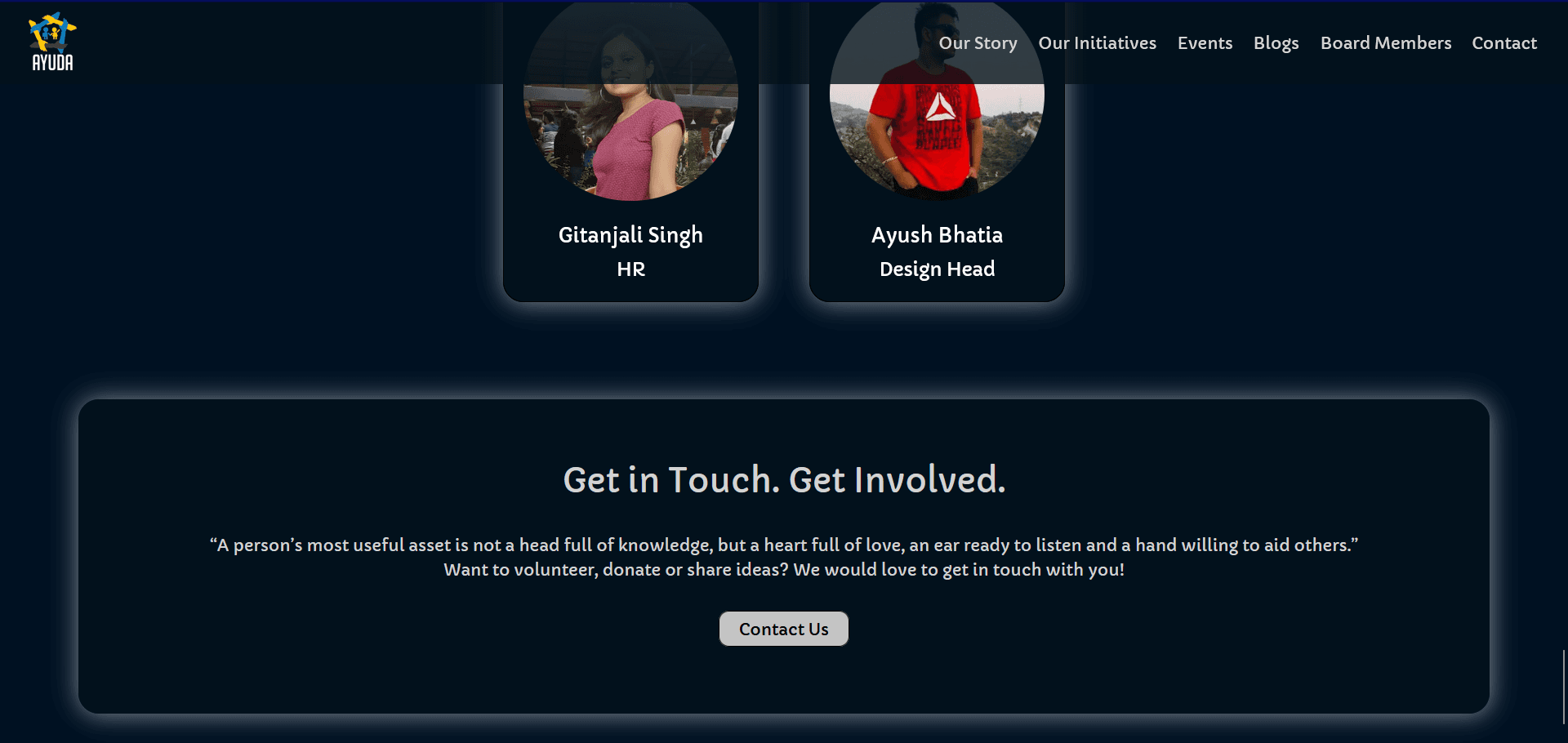
- Poor implementation of shadows throughout the website. The off-white shadow looks odd and artificial. Moreover, these shadows appear to highlight elements rather than adding depth, which detracts from the overall visual appeal of the website.
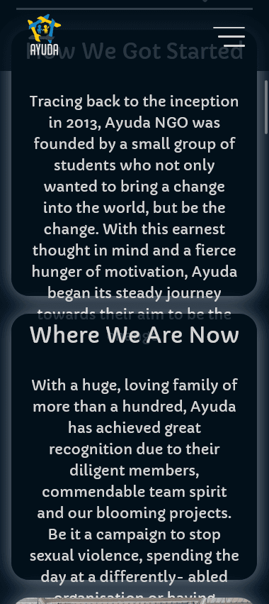
2. Improper Device Responsiveness
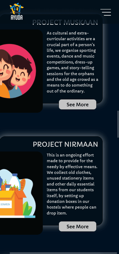
While the website does incorporate responsive design elements, it fell short of providing a consistently smooth experience across various device types and orientations. Specifically, small devices encounter issues like content overflow and improper image rendering.

3. Unclear Call-To-Action (CTA) elements
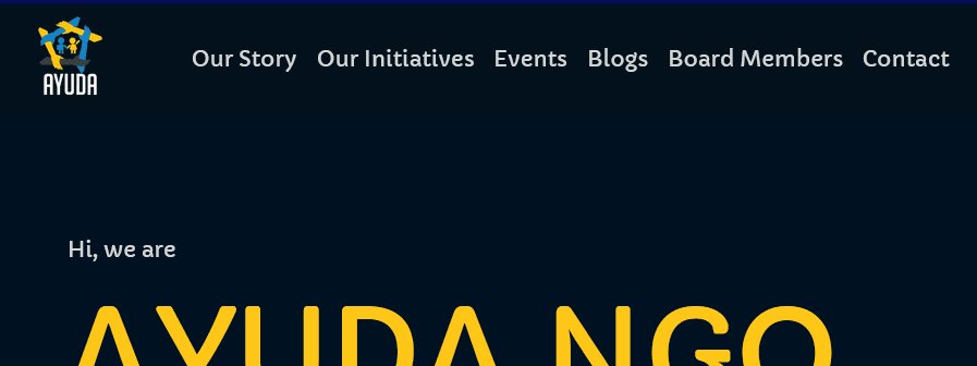
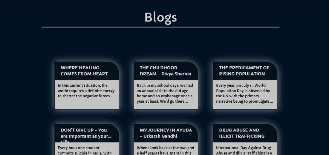
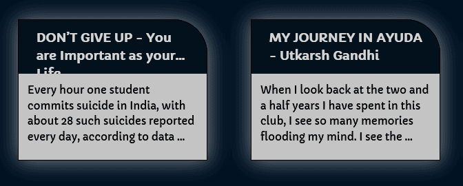
- The website’s CTA elements, such as the navigation bar and blog cards, fail to guide the user’s attention effectively.
- The navigation bar lacks interactive feedback and sufficient distinction, making it unclear if the items are interactive. Similarly, the design of the blog cards does not adequately indicate that they are elements meant for user interaction.
4. Poor Content Design
The absence of a clear visual hierarchy makes it harder for users to recognize the most important content at a glance. This lack of systematic organization may affect readability for users, thus resulting in reduced engagement and willingness to participate in the organization’s activities.
Mood Statements and Expectations
After observing the user’s behavior and gathering website feedback, I then asked about their mood and visual design preferences to gain deeper insights into their expectations.
I considered this feedback along with the team’s comments to create a combined version of all mood statements and visual expectations. This exercise helped me to understand the emotions and feelings that the website design should evoke in its users.
Mood Statements
- To deliver a modern and fresh look
- To engage all visitors, and present information in a clean manner
- To inspire people to get involved with Ayuda NGO
- To create a sense of trust and credibility for our organization
Visual Expectations
- Should have a clean and elegant design with easy navigation
- Should properly display and present content and graphics
- Should have a bright and cheerful color scheme to reflect the positive impact and work done
- Mobile-friendly design and responsiveness
Design Process
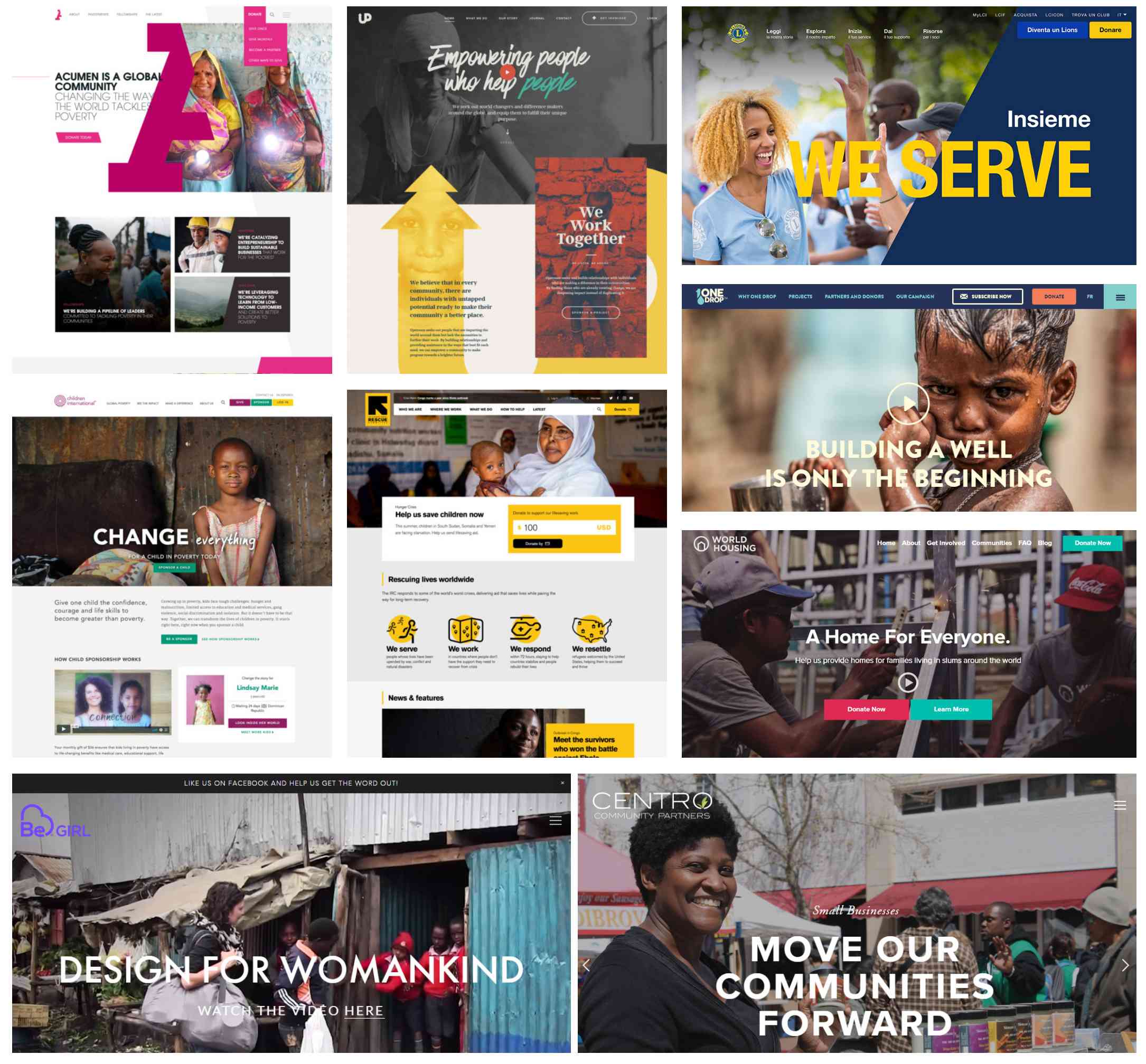
Mood board
I made a mood board to reflect the overall visual direction and aesthetic of the website. This helped me to ensure that the website design would meet the requirements of the target audience and reflect the positive impact of Ayuda NGO on its visitors.
Visual Style Guide
After creating the mood board, I selected colors and typography styles that resonated with the brand values and mission to create a new and fresh look for the website.

Redesign
While working on the redesign, I focused on improving the overall user experience and aligning the design with Ayuda’s mission and values. To modernize the website, I incorporated the following design trends:
- Bold colors and typography: Employed to capture attention and make a strong visual statement, while aligning with the organization’s theme.
- Glassmorphism: Utilized for its frosted glass-like elements that add depth and create a multi-layered visual experience.
- Micro-Animations: Including hover effects, text effects, and ease-in effects to enhance interaction and feedback experience
- Effective Whitespace use: To aid in readability and content focus, making the website less cluttered.
 Old Look
 New Look
Blog Section
I incorporated a card layout that allows for more content and clear highlights of important keywords. CTA elements were made more visible to guide user interactions. Employed glassmorphism to bring a sense of depth and modernity to each card. Additionally, an eased-in horizontal scroll was implemented, enhancing the user’s exploration experience and potentially encouraging them to discover more.
 Old Look
 New Look
Team Section
For the Team section, I updated the card design to include more space for pictures and subtle hover effects. I revised the layout to accommodate social media links to encourage visitors to connect with team members to bolster the organization’s credibility.
 Old Look
 New Look
Initiatives Section
The redesigned initiatives section features a simplistic card structure that helps organize the content better. This is accompanied by a customizable background image on each card along with a parallax carousel design which further aims to improve the interactivity and content organization of the section.
 Old Look
 New Look
Responsive Design
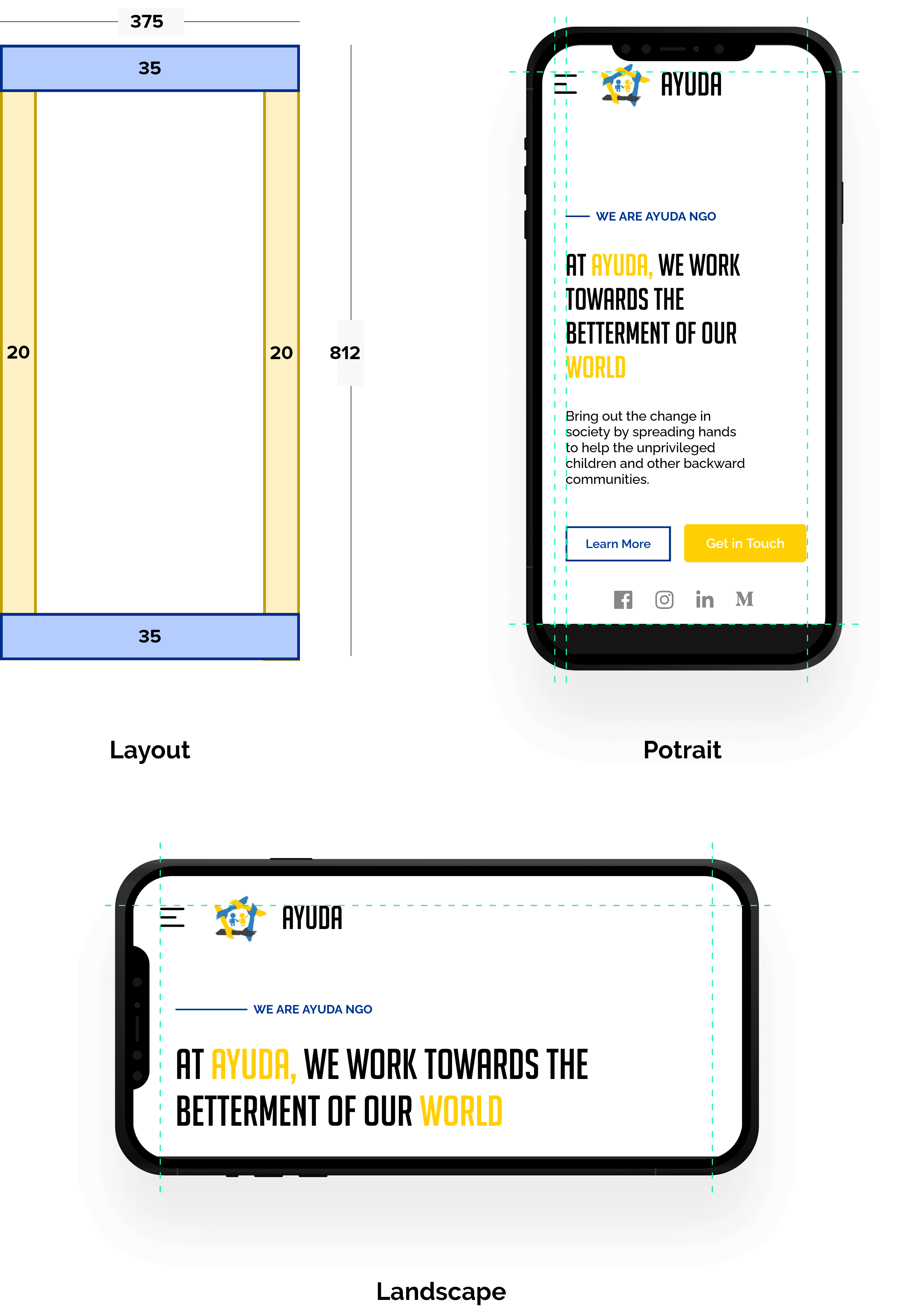
For responsive design, I started by designing screens for small devices such as mobile phones, and then moved on to medium-sized screens such as tablets and notebooks.
- Layout Consistency: Utilized a consistent layout structure to maintain a uniform look and feel across all device types.
- Media Queries: Employed media queries to automatically adapt the layout based on different screen sizes and breakpoints
- Grid System: Implemented a grid system to ensure the layout is fluid and adjusts according to the device’s screen dimensions.
- Responsive Typography: Incorporated responsive typography techniques to optimize font size and style, thereby enhancing readability across different screen sizes.
.228b1619.png&w=3840&q=75)
Development
Technical Considerations
Before beginning development, I took careful consideration in selecting the right technologies for the redesign project and ultimately chose to use React, Sass, and Gatsby. The main reason for using these was because of reliable production features and their stable compatibility with each other.
- React: Chosen for its modular and scalable architecture, making code management and future feature additions more straightforward.
- Sass: Selected for its ability to enhance CSS capabilities. Sass made it possible to reuse styles across the website, which helped to keep the design consistent and cohesive.
- Gatsby: Provided performance optimization features like image optimization, preloading, and code splitting, ensuring fast load times.
Results and Feedback received
After completing the website’s development and testing it across various devices, I conducted user testing sessions with five participants. These participants included university students, faculty members, and general users. The goal was to assess the effectiveness of the redesign in terms of feature improvements, overall usability, and cross-device responsiveness.
For this I conducted online sessions with participants to observe their behavior while interacting with the redesigned website and gained their feedback and opinions on the new design.
Conclusion
By focusing on visual design, responsive features, and a user-centric approach, I successfully delivered a redesigned website that effectively represents Ayuda’s mission and brand.
Team Handoff
To effectively hand off the website to Ayuda, I used a headless CMS setup with JSON data files to help authorized members of Ayuda to easily update the website with the latest information, without needing to know code.
Additionally, I also held info sessions the team members to help them navigate the process smoothly and make any custom changes if required..

